Typewriter font: what font looks like a typewriter?
Courier is the classic typewriter font. See how Courier New, Courier Prime, Special Elite and American Typewriter differ, and what no font can fake.
Courier is the font that looks like a typewriter. It was designed for IBM's typewriters in the mid-1950s, and its digital descendant, Courier New, ships with both Windows and macOS. For a darker, more readable version, use Courier Prime, which is free. For the worn, inky look of an old machine, use Special Elite, also free.
Real typewriters never shared one font, though. Each maker cut its own type, and the faces below are the ones you will meet in font menus today.
Why typewriter type looks the way it does
Three things mark a typewriter face: every character is the same width, the serifs are thick slabs, and the strokes barely vary in thickness. All three come from the machine.
Every character gets the same width
A typewriter's carriage moves one fixed step after each keystroke. The step is set by a rack with evenly spaced teeth, so the machine gives an i exactly as much room as an m. Type built for that is called fixed-width, fixed-pitch or monospaced.
Designers had to make the even spacing look natural. As Alice Savoie's history of monospaced typefaces describes, wide letters such as m and w were drawn very narrow, and thin letters such as i, j and l were given large serifs to fill their slot. The wide foot under a typewriter i is there to take up room.
Proportional-spacing typewriters appeared in the 1940s, but fixed pitch remained the norm.
Slab serifs and one stroke weight
Typewriter letters are struck. A raised metal letter hits an inked ribbon against the paper, and delicate shapes are a liability. The same history notes that sharp serifs and strong contrast between thick and thin strokes risked tearing the paper, while sturdy slab serifs with little or no contrast suited the technology. That is where the even, single-weight line of most typewriter faces comes from.
Pica and elite are sizes, not designs
Pica and elite describe pitch, the number of characters in one inch of a line. Pica is 10 characters per inch and elite is 12, and both set six lines to the vertical inch. Each manufacturer sold its own pica and elite faces, so the words tell you how dense the typing is, not what the letters look like. On a computer, Courier at 12 points gives pica spacing and Courier at 10 points gives elite. The typewriter's pica is also not the printer's pica, a unit of length equal to one sixth of an inch.
The typewriter fonts worth knowing
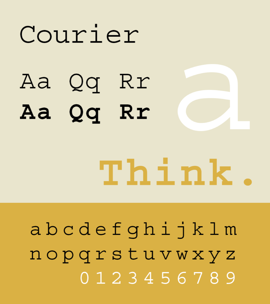
Courier, the original
Howard Kettler, known as Bud, designed Courier for IBM. Microsoft's notes on the font give the year as 1955 or 1956, and other sources split the same way. IBM did not trademark the name, which is one reason so many companies sell a Courier of their own. It became one of the most common faces in office typing, and 12-point Courier is still the standard for screenplays, where uniform spacing keeps page counts comparable from one script to the next.
Courier New, the one you already have
Courier New is Monotype's digital version. It has shipped with Windows since version 3.1 and comes with macOS too.
It looks thin and gray on the page, and Microsoft's typography team has explained why. According to Monotype, the outlines were digitized directly from the type ball of an electric typewriter. The raised letters on the ball were made thin on purpose, because ink spreads when they strike the paper. Courier New kept the thin shapes without the ink.
Courier Prime, the screenwriter's Courier
Alan Dague-Greene designed Courier Prime for the screenwriter John August and Quote-Unquote Apps. It was released in January 2013, is free under the SIL Open Font License, and is on Google Fonts.
According to its makers, it is slightly heavier than Courier to balance the white space on a script page, and its italics are a separate design, not slanted upright letters. It also matches Courier's metrics, so it can often replace Courier one for one.
American Typewriter, the one that is not monospaced
ITC released American Typewriter in 1974, designed by Joel Kaden and Tony Stan. It keeps the long serifs and rounded ends of typewriter letters but is proportional: the i is narrow and the m is wide, as in a book face.
That makes it comfortable in headlines and wrong for anything that depends on columns lining up. It comes with macOS and iOS, and a lightly modified version is the lettering in the I Love New York logo.
Special Elite, the worn one
Special Elite, from Brian J. Bonislawsky's foundry Astigmatic, imitates the type of two vintage typewriters, with the blots and rough edges left in. It is free under the Apache License and on Google Fonts.
Two cautions. It has a single weight, and it is not truly fixed width: its letters vary in width and its space is about half as wide as a letter, so text will not line up in columns.
Cutive Mono, the old office look
Vernon Adams based Cutive Mono on the faces of classic office typewriters. It is a true monospace with one weight, free under the Open Font License.
Prestige Elite and Letter Gothic, the other office faces
Two more came out of IBM. Prestige Elite dates from 1953. It is usually credited to Clayton Smith, though some foundries name Kettler. Its slab serifs follow the Clarendon model, where Courier's are plain and geometric.
Letter Gothic, drawn by Roger Roberson between 1956 and 1962, is a monospaced sans serif that suits tables and technical documents. Both are commercial fonts today, offered through Adobe Fonts and other foundries.
TT2020 and IBM Plex Mono, two newer free options
TT2020, by Fredrick Brennan, is an open source face built to look typed, not typeset. It carries nine slightly different versions of each glyph and cycles through them using OpenType contextual alternates, so repeated letters do not match exactly.
IBM Plex Mono, released in 2017, is a clean modern monospace whose italic was influenced by one of IBM's typewriter italics. Both are free under the Open Font License.
Typewriter fonts compared
| Font | Monospaced | Cost | Best for |
|---|---|---|---|
| Courier New | Yes | Bundled with Windows and macOS | Files that must look the same on any computer |
| Courier Prime | Yes | Free | Screenplays, manuscripts, long text |
| American Typewriter | No, proportional | Bundled with macOS and iOS | Headlines, posters, logos |
| Special Elite | No, widths vary | Free | A worn, inky, old-letter look |
| Cutive Mono | Yes | Free | A vintage office-typewriter look |
| TT2020 | Yes | Free | Typing that should look uneven |
| IBM Plex Mono | Yes | Free | Clean modern text and code |
| Prestige Elite | Yes | Commercial license | An electric-typewriter office look |
| Letter Gothic | Yes | Commercial license | Tables and technical documents |
What a font cannot fake
A font holds one drawing of each character. Type the word letter and both e's are identical: same shape, same height, same flat black. A typed page never looks like that.
On a real machine, every letter is a separate impact. On a manual typewriter, a key hit harder prints darker. A fresh ribbon prints black and a tired one prints gray, and the weave of a cloth ribbon shows in the strokes. A typebar that is slightly out of true prints its letter a little high, low or tilted.
Distressed fonts get part of the way by drawing damage into the outlines, but the same nick then repeats on every copy of that letter. TT2020's alternates break up the repetition in software that supports them. What an ordinary font still cannot vary is the ink: every character is filled with the same flat color.
A simulator can go further because the font is only its starting point. The Typebar typewriter strikes each letter separately, so ink density and alignment vary from one character to the next, the way they do on paper. You can then print the page or save it as a PDF or an image.
Which typewriter font to use
- A file that must open the same on any computer: Courier New.
- A screenplay, a manuscript or anything long: Courier Prime.
- A letter, prop or invitation that should look old: Special Elite or TT2020.
- A headline, poster or logo: American Typewriter.
- Tables and figures: any true monospace, or Letter Gothic for a sans serif.
To set one up, see how to get a typewriter font in Google Docs and Word. If you only need a line or two of typewritten text, the typewriter font generator is quicker than installing a font.
Questions people ask
- What font looks like a typewriter?
- Courier is the classic typewriter font, designed for IBM typewriters in the mid-1950s. Courier New ships with Windows and macOS, Courier Prime is a free and slightly heavier redesign, and Special Elite imitates worn typewriter type.
- What font did real typewriters use?
- There was no single typewriter font. Each manufacturer made its own faces, usually in two sizes: pica at 10 characters per inch and elite at 12. Courier was one of IBM's faces and became the best known.
- Is American Typewriter a monospaced font?
- No. American Typewriter, released by ITC in 1974, has typewriter-style letter shapes but proportional spacing, so its letters have different widths. Use Courier New or Courier Prime when every character must be the same width.
- What is a good free typewriter font?
- Courier Prime is a strong free choice for clean, readable typed text, and it is released under the SIL Open Font License. For an old, inky look, Special Elite is free on Google Fonts, though its letters are not strictly fixed width.
- What is the difference between pica and elite type?
- Pica and elite are typewriter sizes measured in characters per inch. Pica fits 10 characters to the inch and elite fits 12. In Courier, 12-point text matches pica spacing and 10-point text matches elite.