American Typewriter font: history and free alternatives
American Typewriter is ITC's 1974 typewriter-style typeface. Who drew it, where it comes installed, what a license covers, and free fonts that come close.
American Typewriter is a slab serif typeface drawn by Joel Kaden and Tony Stan and released by International Typeface Corporation (ITC) in 1974. It borrows the look of typewriter letters but spaces them proportionally, so it reads like a text face, not a typed page. It comes installed on Macs and iPhones. It is a commercial font owned by Monotype, and there is no free version. A few free fonts come close, each with a trade-off covered below.
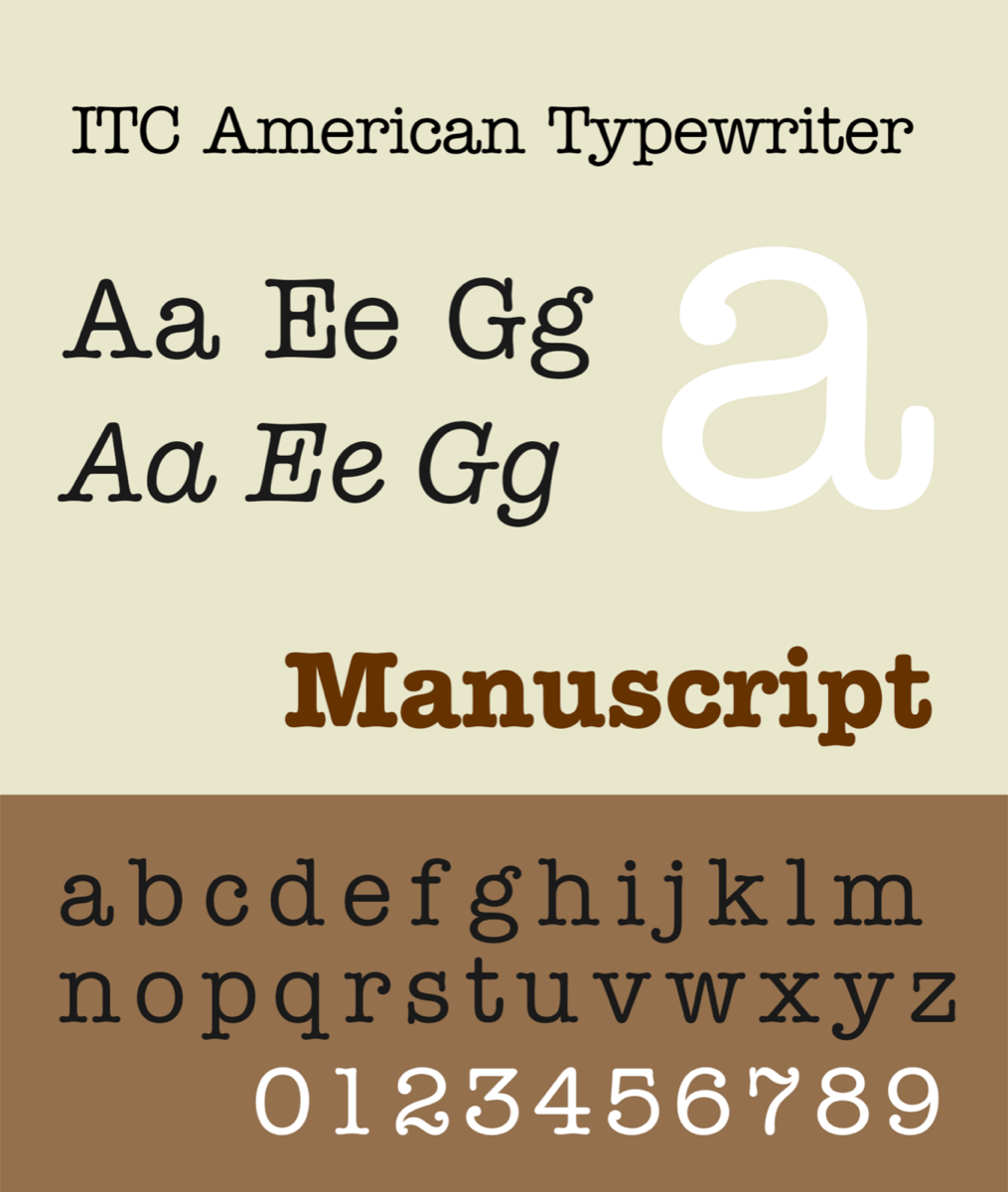
Who designed American Typewriter, and when
ITC was founded in New York in 1970 by Aaron Burns, Herb Lubalin and Edward Rondthaler. American Typewriter was one of its early text families. It arrived in the age of phototypesetting and was digitized later.
Two designers shared the work. According to Fonts In Use and Monotype's own notes on the family, Joel Kaden drew the two lighter weights and Tony Stan drew the bold.
The usual release date is 1974, and it holds up with one footnote. ITC announced the family officially that year in its magazine, U&lc, in two widths and three weights. The magazine had already mentioned it in its first issue, in 1973, as the company's newest text type. Italics came much later: Ed Benguiat added them in 1989.
Monotype's field guide to the family ties the 1974 release to the hundredth anniversary of the typewriter's invention. The dates fit only if you count from the product, not the patent. The patent behind the first commercially successful typewriter was granted in 1868, and that machine went on sale in 1874.
The aim, as the foundry describes it, was to keep the familiar, personal feel of typed text while fixing its weaknesses in readability.
American Typewriter is proportional, not monospaced
On a typewriter the carriage moves the same distance after every key, so an i takes as much room as an m. That fixed pitch is what makes typed text look typed.
American Typewriter drops it. Each letter gets its natural width, the way it would in a book face. What it keeps are the cues: blunt slab serifs, rounded stroke endings and strokes of nearly even weight. It is a friendly interpretation of typewriter lettering, not a copy of any machine's type.
That choice has practical effects:
- Text set in it will not line up in columns the way typed or monospaced text does.
- It will not pass for a page that came out of a real machine.
- Formats built on fixed pitch, such as screenplays written in 12-point Courier, do not work in it.
Weights and styles in the family
The family you can license today and the copy bundled with Apple devices are not the same set.
| Version | Styles |
|---|---|
| ITC American Typewriter Pro, sold by Monotype | Light, Medium and Bold, each with an italic, plus Light Condensed, Medium Condensed and Bold Condensed. Nine styles. |
| American Typewriter on Apple devices | Light, Regular, Semibold and Bold, plus Condensed Light, Condensed and Condensed Bold. Seven styles, no italics. |
If you came looking for American Typewriter Bold, both sets include it, and it is the weight Stan drew. The condensed styles are the ones to reach for in tight headlines and labels.
Monotype's field guide makes two practical points. The two lighter weights stay legible at small sizes. The long serifs can touch when letters are set too tight, so leave the letter spacing alone.
Where American Typewriter comes installed
Apple lists American Typewriter as a system font on macOS, iOS and tvOS, and all seven styles appear in its list of fonts included with macOS 27. On a Mac, open Font Book and search for the name to see them.
Windows does not include it. It is absent from Microsoft's list of fonts shipped with Windows 11, where the typewriter-style option is Courier New. Two things follow:
- A document set in American Typewriter on a Mac falls back to another font when it is opened on a PC without it. Export a PDF if the look matters.
- A web page that names American Typewriter in its CSS shows it only to visitors whose devices have it, which in practice means Apple devices. Everyone else gets the fallback, unless the site serves a licensed web font.
Licensing: a commercial font owned by Monotype
Agfa Monotype, now Monotype, bought ITC in 2000. The name ITC American Typewriter is a trademark of Monotype ITC Inc. The family is sold on MyFonts, by the style or as a set, with separate licenses for desktop use, websites, apps and other uses. It is also available through Adobe Fonts for Creative Cloud subscribers.
There is no free, authorized download of American Typewriter. Sites that offer the font files for nothing are not licensed sources, and this article does not link to any.
If you own a Mac, you already have a licensed copy for use on that Mac. Apple's software license agreement for macOS lets you use the bundled fonts to display and print content while running macOS, and lets you embed them in content only where the font's own embedding restrictions allow. Font Book shows those restrictions for each font.
That is not a web font license or an app license. Monotype sells both separately. For a logo or any commercial job where the stakes are real, read the terms or ask Monotype instead of assuming.
Famous uses of American Typewriter
The best known is Milton Glaser's I Love New York logo, drawn in 1976 and introduced in 1977. It is usually described as set in American Typewriter, which is close but not exact. According to Fonts In Use, Glaser asked his colleague George Leavitt to modify the letters. The serifs were made thicker, and the result is slightly bolder than the Medium weight. Typing the letters in the stock font gets you near the logo, not onto it.
Two television examples need no such footnote. Fonts In Use documents American Typewriter in the logo of the US version of The Office, from 2005, and on the poster and titles of Young Sheldon, from 2017.
Free alternatives, and how each one differs
No free font reproduces American Typewriter. These four are open source and available from Google Fonts, and each one gives up something.
| Font | Spacing | Styles | How it differs |
|---|---|---|---|
| Cutive | Proportional | Regular only | Closest in idea: letterforms drawn from classic typewriter faces, at natural widths. No bold and no condensed. |
| Josefin Slab | Proportional | Thin to Bold, with italics | A geometric slab in a 1930s manner. Its designer notes some typewriter-style attributes, but the resemblance is loose. |
| Special Elite | Nearly fixed, not strictly | Regular only | Modeled on the type of vintage typewriters, with ink texture built in. It looks typed, not redesigned. |
| Courier Prime | Monospaced | Regular, Italic, Bold, Bold Italic | A true fixed-pitch face made for screenplays. Plainer and stiffer than American Typewriter. |
Cutive, Josefin Slab and Courier Prime are published under the SIL Open Font License. Special Elite is under the Apache License 2.0. All four allow commercial use.
One detail in that table catches people out. Special Elite looks monospaced, but its letters vary slightly in width, so do not rely on it to align columns. Cutive has a separate monospaced sibling, Cutive Mono, for that job.
If you need American Typewriter itself, from Light to Bold and in condensed widths, license it. If you only need the flavor, Cutive is the nearest free match for headlines and short text, and Courier Prime is the practical choice when you need bold and italic.
To try typewriter lettering on your own words before installing anything, use Typebar's typewriter font generator. For a wider survey of the options, see what font looks like a typewriter.
When a true monospaced typewriter face is the better choice
American Typewriter suits headlines, logos, packaging and captions: places where you want the association with typing and still want a normal reading rhythm. Choose a monospaced face instead in these cases:
- The text has to look typed. Letters, props, mock documents and period pieces depend on fixed pitch. Proportional spacing gives the game away at a glance.
- Columns have to align. Anything laid out with spaces, from a typed table to text art, needs every character to be the same width.
- A format requires it. Screenplays are the usual case. Courier Prime is built to match the metrics of Courier at 12 point.
Even a monospaced font stops short of the real thing, because every e it sets is identical. On a machine, each strike lands with slightly different ink and alignment. If that is the effect you are after, type the page on Typebar, a free typewriter simulator with struck ink and a moving carriage, then print it or export it as a PDF or image.
Questions people ask
- Is American Typewriter a free font?
- No. It is a commercial typeface from ITC, and its trademark belongs to Monotype. A copy comes installed on Apple devices, and licenses for other uses are sold through MyFonts or included with Adobe Fonts, but there is no authorized free download.
- Is American Typewriter monospaced?
- No. It is a proportional typeface, so an i is narrower than an m. It borrows the slab serifs and rounded strokes of typewriter lettering without the fixed spacing, which means it will not line up in columns or pass for a typed page.
- Does Windows come with American Typewriter?
- No. Apple lists it as a system font on macOS and iOS, but it does not appear in Microsoft's list of fonts shipped with Windows 11. On a PC you need to license the font or pick an alternative such as Cutive or Courier Prime.
- What font is the I Love New York logo?
- The letters are based on American Typewriter, but they are not the stock font. According to Fonts In Use, Milton Glaser had the letterforms modified by a colleague, George Leavitt, with thicker serifs and a slightly bolder weight than Medium.
- What is the closest free font to American Typewriter?
- Cutive is the closest in idea: typewriter letterforms with proportional spacing, under the SIL Open Font License. It has one weight only. If you need bold and italic, Courier Prime is free too, but it is monospaced and looks more like a real typed page.